Design Placement: The Do's and Don'ts
Design Placement: The Do's and Don'ts
Whether you're a seasoned pro or just getting started, understanding the nuances of design placement is essential for creating eye-catching and comfortable custom apparel. In this blog post, we'll explore the do's and don'ts of T-shirt design placement to help you achieve the perfect look.
The Do's:
1. Consider Your Placement:
The central design area on a T-shirt is typically around the chest area, where it's most visible. Place your main design elements, logos, or messages in this region for maximum impact. Our production team will accurately center and place designs using your mockup as their guide.
2. Balanced Composition:
Ensure your design is well-balanced within the chosen placement area. Consider factors like symmetry, spacing, and alignment to create a harmonious look that's visually appealing.
3. Size Matters:
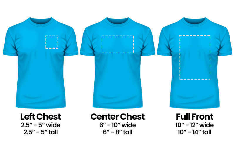
Adjust the size of your design elements accordingly. When designing, consider placement and avoid small, thin, or faint details for smaller prints. Below is a great visual of some of the most standard design sizes and placements.
Pro Tip for Maximizing Earnings: When fine-tuning your design size on our platform, keep an eye on the base cost—it adjusts in real-time! Even a slight reduction in the design's dimensions can lead to lower production costs, meaning you could earn more each time that item sells. So, don't miss out on maximizing your profits by paying close attention to those adjustments. Every little bit helps to boost your earnings!
The Don'ts:
1. On the Chest, Right is Usually Wrong:
Design placement can be a bit puzzling, and one aspect that often perplexes folks is the choice between left and right chest placement. While the left chest is a tried-and-true classic, the right chest placement is a less conventional option. The left chest, as the name suggests, positions the design directly over the wearer's heart, making it a common and meaningful choice.
2. A Big Ol' Image without Negative Space
We've all seen it – those designs that cover every inch of a T-shirt, leaving no room for the fabric to breathe. While it might work as a striking poster or a vertical social media post, it's a whole different story when it comes to wearable art. At MerchYeah!, we've got your back with a max-oversized print area reaching an impressive 16" x 20" on some garments. However, going "all over" without negative space is never the way to go. Negative space isn't just empty; it's a powerful design element in itself. It can draw attention to the main focal points of your design, create contrast, and enhance readability.
3. Avoid Belly Designs:
Placing a design too low, near the belly area, can look awkward and unflattering. It may also stretch or distort when the shirt is worn.
4. Overcrowding:
Resist the temptation to overcrowd the design area with too many elements, text, or graphics. Cluttered designs can be distracting and unappealing.
5. Ignoring the Back:
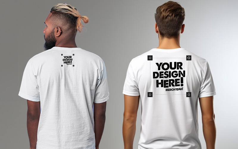
Don't forget about the back of the T-shirt. Consider adding complementary designs, logos, or messages to the back for added visual interest. Standard back placements are typically either a Full Back or a smaller badge usually placed just below the back collar and centered on the spine between the shoulder blades.
Remember: Less Can Be More
Sometimes, simplicity is key. A well-placed, minimalist design can be just as impactful as an elaborate one. Consider the message you want to convey and the emotions you want to evoke when deciding on design placement.
In conclusion, mastering T-shirt design placement requires a blend of artistic intuition and practical considerations. By following the do's and avoiding the don'ts, you'll be well on your way to creating T-shirts that not only look great but also feel comfortable and appealing to your customers. Get those designs ready, start creating, and let your creativity shine!
Create merch now.
Start selling in minutes or
order for your next event.